Vanguard
2015 – 2016
Vanguard’s FA division provides products and digital tools to financial advisors to help manage their client assets. I contracted for the FA – UX team where I worked on several public facing projects.
PROJECT 1
Product Selection
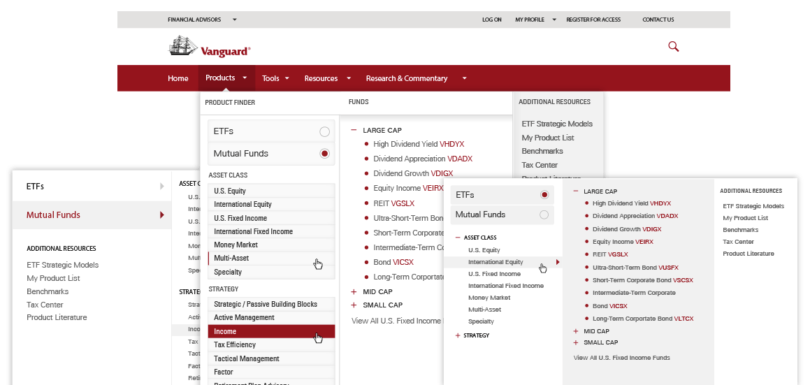
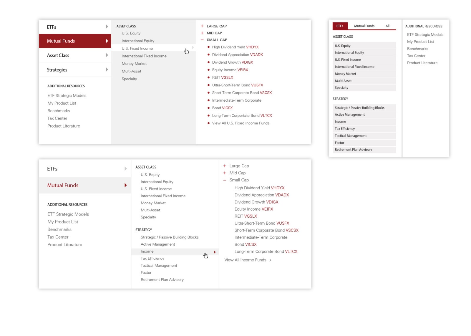
Designing complex product selection into a global navigation menu
My Role
- Role: Lead designer
- Team: Information architect (SME), product owner
- Practices: User research, low-fidelity, prototyping, user-testing, UI design
- Tools: Illustrator, jQuery, Bootstrap, CSS
Brief
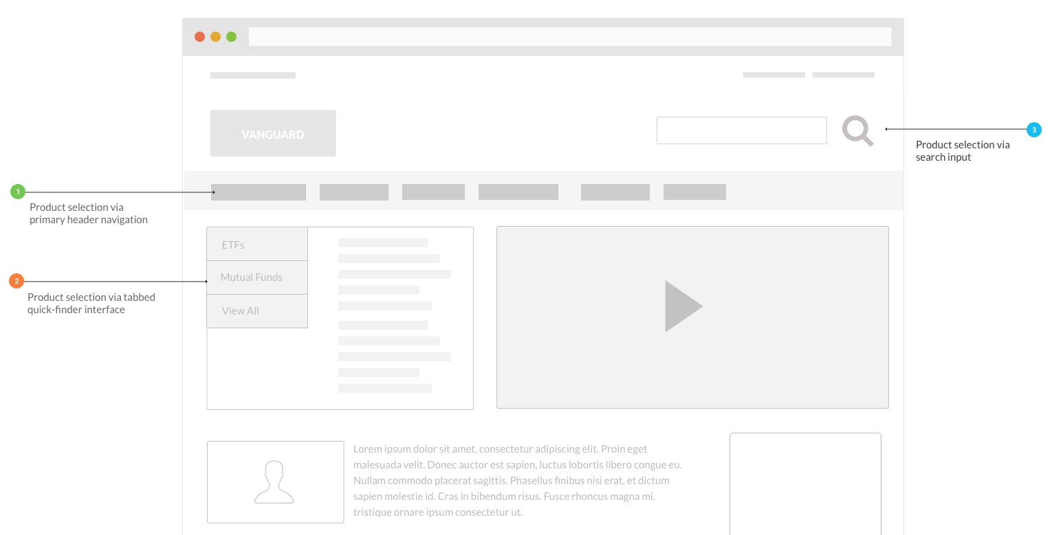
Our website had 3 different methods to navigate to a product page, but most users were only using one of them. Leadership wanted to rethink product navigation site-wide while also adding new categories and implementing a new style guide.
Existing methods of navigating to a product page
User Research
My data included:
- A deep well of site analytics and historical usage data
- Eye tracking studies on our existing homepage navigation
- Interviews I conducted with expert user advocates
- Conversations with the team that designed the existing navigations
Key findings:
- Users largely ignored the quick-finder and search tools
- Primarily used the menu-bar navigation to go straight to the listings page
- Kept the listing page open while viewing several products on other tabs
- Many repeat visits throughout the day
User Profiles
Came to the site primarily to research product details
Typically knew the exact type of product they wanted before they got there
They didn’t use search because it was too specific – they had to remember exact names or tickers
Didn’t use the quick-finder because it was too general – it didn’t filter down to 3rd and 4th level categories
More clients and bigger accounts
Spent most of their time on our secondary resources
Took a more indirect path to eventually get to product detail pages
Less than 5 years in the industry
Less clients and smaller accounts
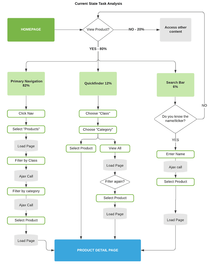
The quick-finder in the hero was intended for power-users to rapidly navigate to product details, so why did most people ignore it?
User Validation
I conducted interviews with our user advocates for more user insight about the existing quick-finder; they all had similar feedback:
“Users don’t know it's there”
“It doesn’t sort by sub-categories”
“It’s simpler to use the navigation bar”
My benchmarks showed that when our user took the path of navigation via the menu-bar, they incurred 2 additional page loads and up to 15 seconds of additional time spent waiting, selecting, and scrolling compared to using the quick-finder tool. Additional conversations with the team brought to light that the quickfinder tool was intended to be more robust originally, but was stripped down due to loading time issues.
Hypothesis: We believe that a product interface with expanded categorization built into our global menu will save time and increase efficiency for expert users.
We’ll prove this by: Benchmarking new prototypes against the existing state navigations tools.
We’ll know we’re right: If the new UI achieves faster end-to-end product navigation for expert users and parity for our general users.
Measures of Success / KPIs
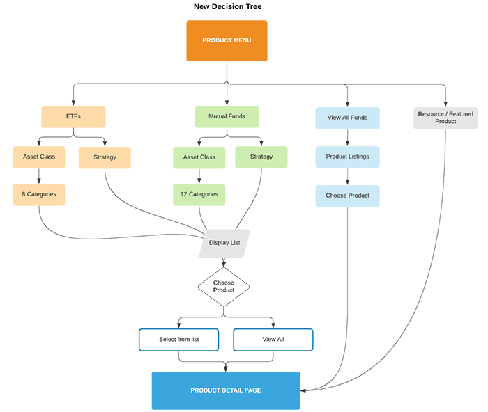
A single interface accessible from anywhere on the website
Deep level navigation for expert users
High level navigation for novice users
Supports our new sub-categories
Displays product symbols (tickers)
Featured product area
Implements new style guide
Responsive Design
Ideation
I proposed 2 approaches to the team:
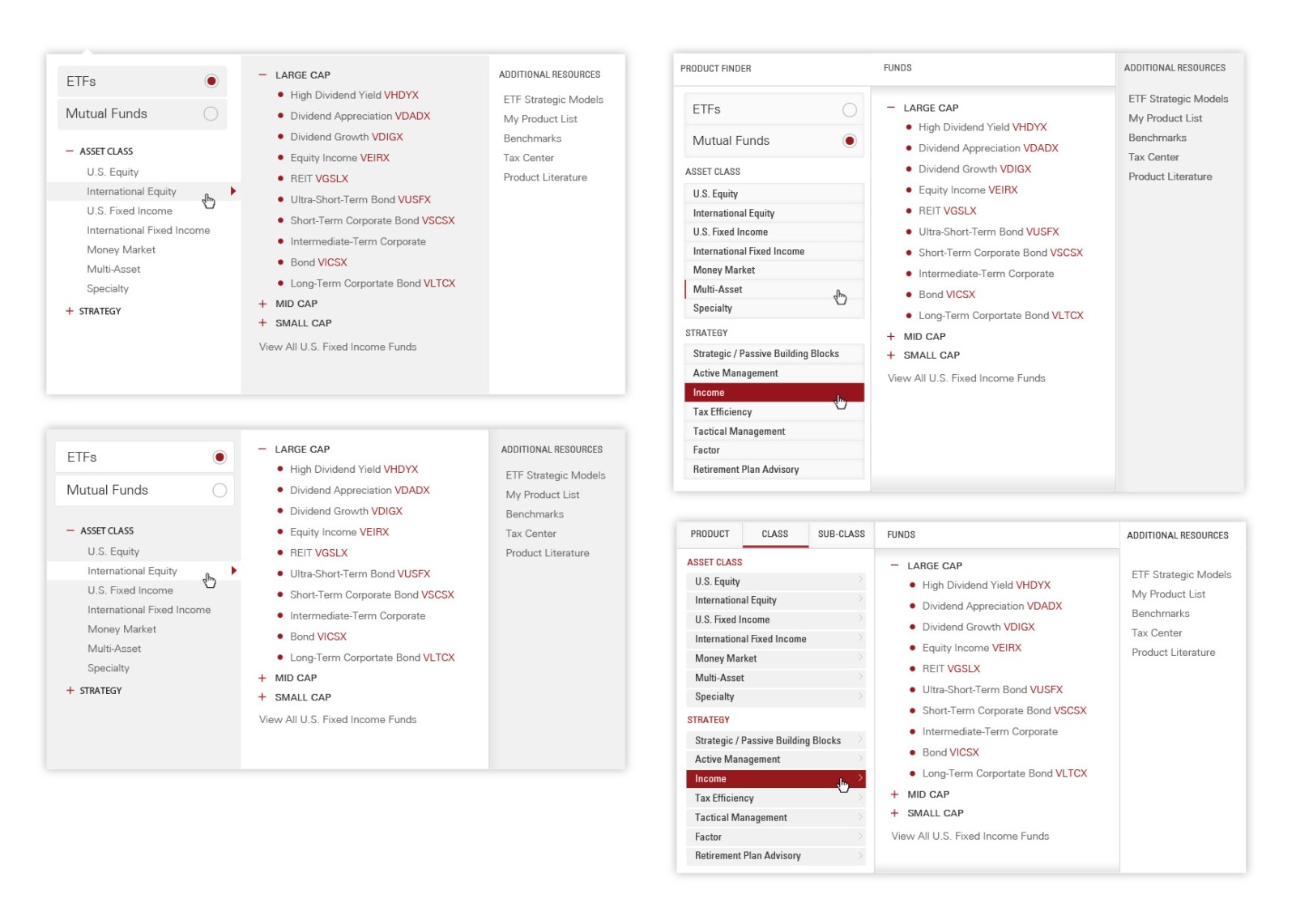
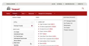
- Design the interface into the global menu bar as a mega menu.
- Launch the interface from the global menu into a modal window.
I presented a list of anticipated pros and cons for each implementation; ultimately we decided to focus on option 1 for performance, usability, and consistency reasons.
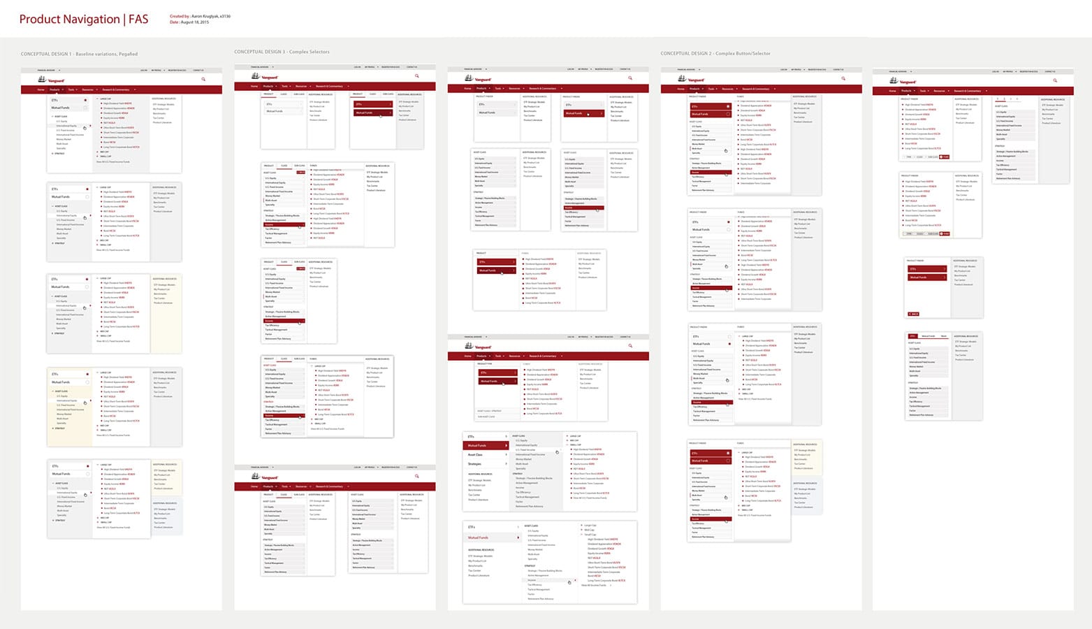
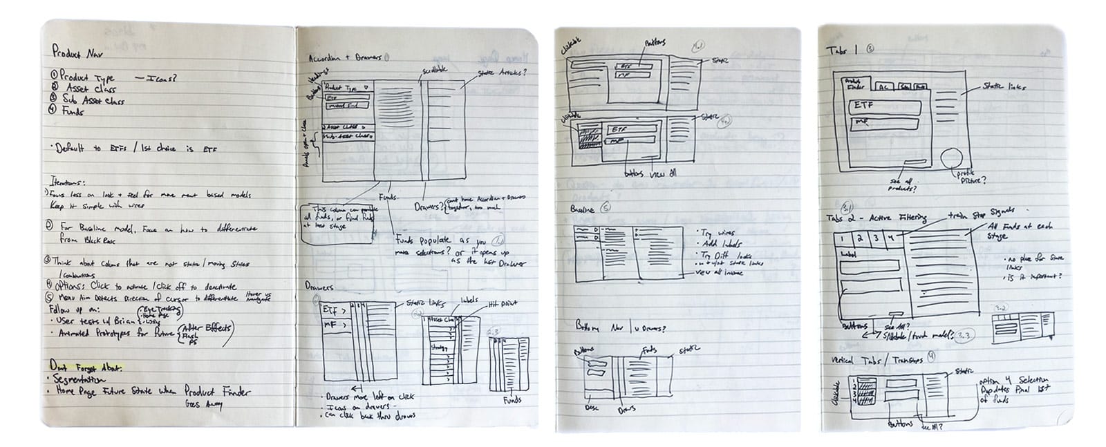
I moved on to conceptualizing a UI that could comfortably sort 4 levels deep while displaying many products in small amount of space. I also had to design for contingency in case this feature didn’t test well. I moved on to exploring complex data trees and multilevel sorting. I collected design patterns and examples of other interfaces that had solved similar problems.
I conducted a competitive analysis on how our top 7 competitors approached this problem while also studying relevant patterns from other industries. Several competitors were using a similar interface in their navigation which helped confirm that our users would be familiar with this method.
Design
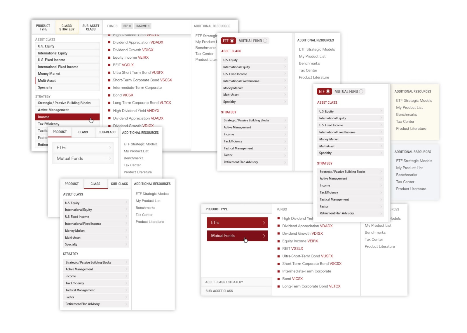
I explored many different design patterns involving different combinations of tabs, accordions, sliding drawers and filters with horizontal and vertical movement through the hierarchy. I used my research to identify which patterns were most successful in similar situations combined with feedback from the design and development teams, along with rapid iterative testing and evaluation, I began to hone in on several potential solutions.
Prototyping
I built fully functional medium and high fidelity prototypes for user testing using a combination of custom jQuery, Bootstrap and CSS. Having fully developed prototypes on the same codebase that our website was built on allowed me to gain early buy-in from our development team and iterate quickly. It also ensured that the performance and load times of the prototype would closely match the performance in production.
Testing
Rapid iterative testing and evaluation
We conducted 3 rounds of user testing with 4 participants each. Led by a moderator, we employed qualitative and quantitative methods to asses several different prototypes which I then iterated on before the next round of testing. We assessed their use of the existing navigation methods to establish a baseline, and then compared those metrics against a new prototype as we asked them to find another product. We injected randomization between the baseline and prototype tests to remove recency biases.
Each step of the interaction was timed and we gathered verbal feedback about their experience after the test. We used our data to calculate effectiveness, efficiency, and satisfaction for each prototype.
As I iterated and we approached our final prototype, verbal feedback was universally positive:
“This feels faster than my usual method”
“I like that I can see all the products from anywhere within the site”
“This new categorization helps me differentiate between similar products”
On our final prototype improved product selection speed by an average of 33% for expert users and 20% for novice users.
Development & Launch
I prepared redlines of the final design along with my prototype and documented code. Unfortunately I had to leave the project right as development was set to begin so I handed off the project to a team member to oversee the launch. The final menu went live on the site several months later.
Retrospective
Our usability tests were complicated by us testing multiple feature changes at once and not having access to users throughout the whole project. As a result, some assumptions had to be made based off existing data and secondhand feedback as apposed to direct user study.
The testing phase served as a reminder that the more steps and decisions a user has to take, the higher the chance for error or confusion. Although I explored a variety of fancy interactions with novel designs, the simpler our design got the better it tested with users.
I was disappointed to leave the project just as development was starting. The final implementation functioned as I intended but some of the subtle UI detail was lost somewhere in translation. If I had stayed on the project I would have liked to continued monitoring the user journey in a live environment to further prove and refine our hypothesis.
The stakeholders were happy with our results and the interface stayed live for about 3 years until a complete site refresh launched in 2019.
PROJECT 2
User Registration
Summary
Scope
Improve the user registration flow.
Brief
Registration was experiencing a high rate of abandonment and phone calls to the help desk.
Problems Identified
- The flow presented many fields all at once to the user
- Too many fields, some of which seemed unnecessary
- Lacked intelligent assistance with filling out the fields
- Form validation all happened at the end and presented errors in a pop-up
- No differentiation between required/unrequired
- Not a mobile friendly UI
Research
I read case studies, research reports and A/B studies comparing various form designs and best practices that led to improved conversions. Generally, the cognitive load of one mega form was always improved by splitting the form into smaller steps, so long as the steps were not too tedious and didn’t require navigating back and forth for vital information.
Solutions
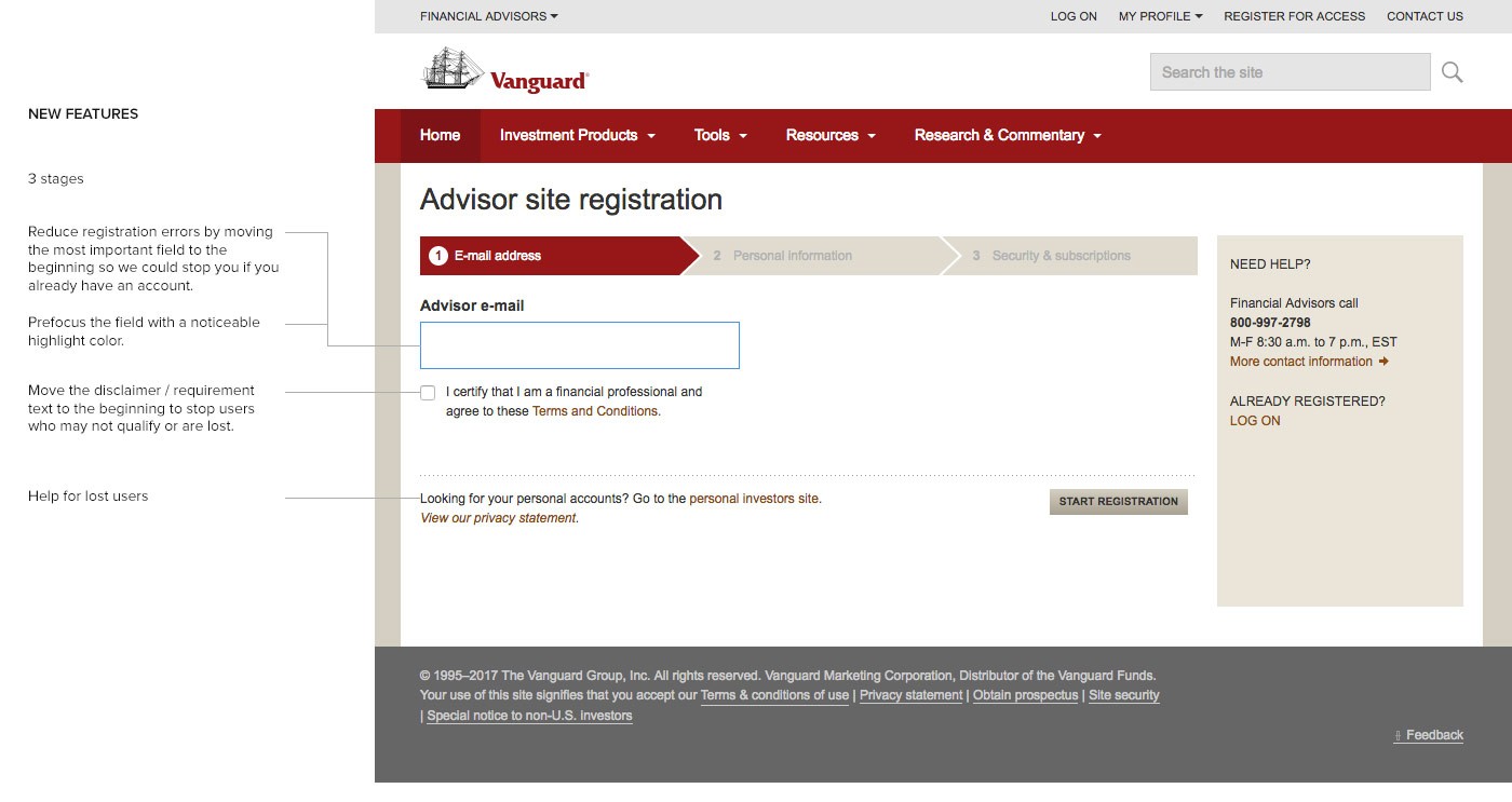
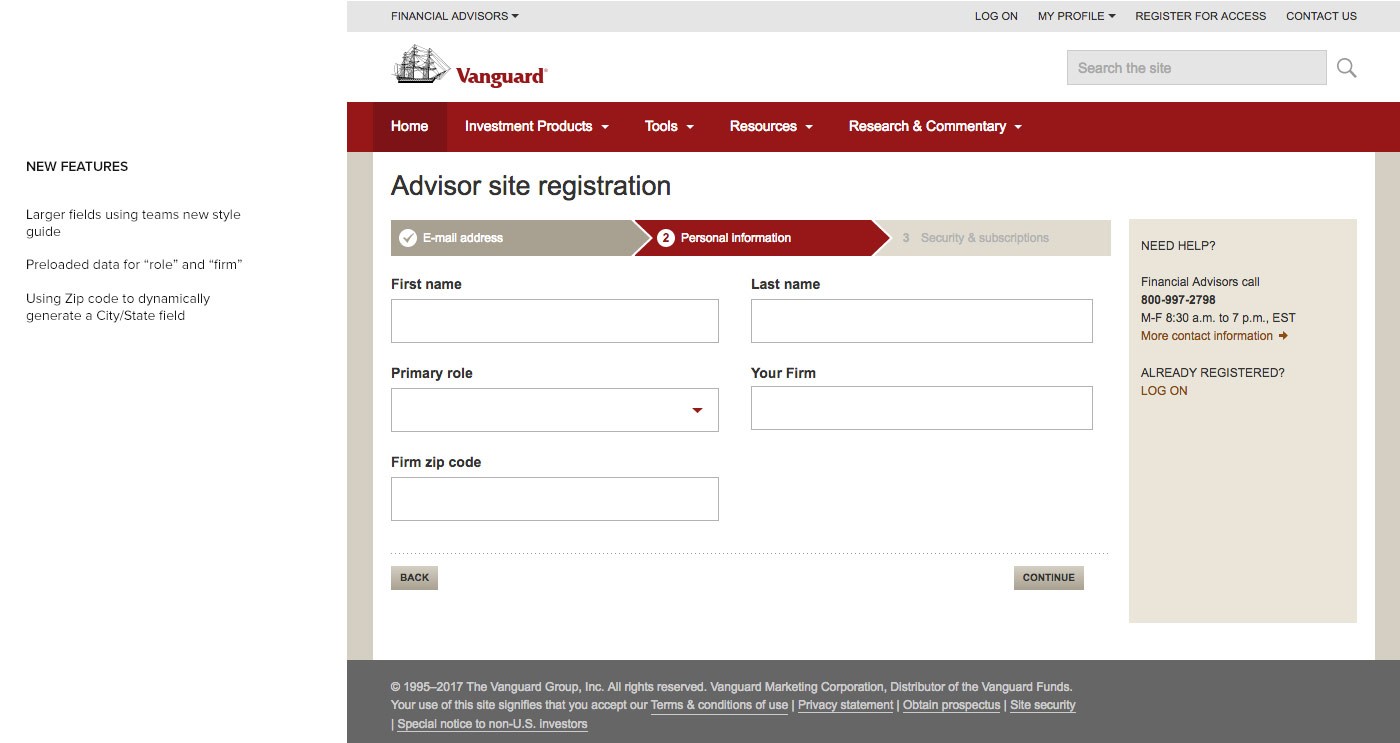
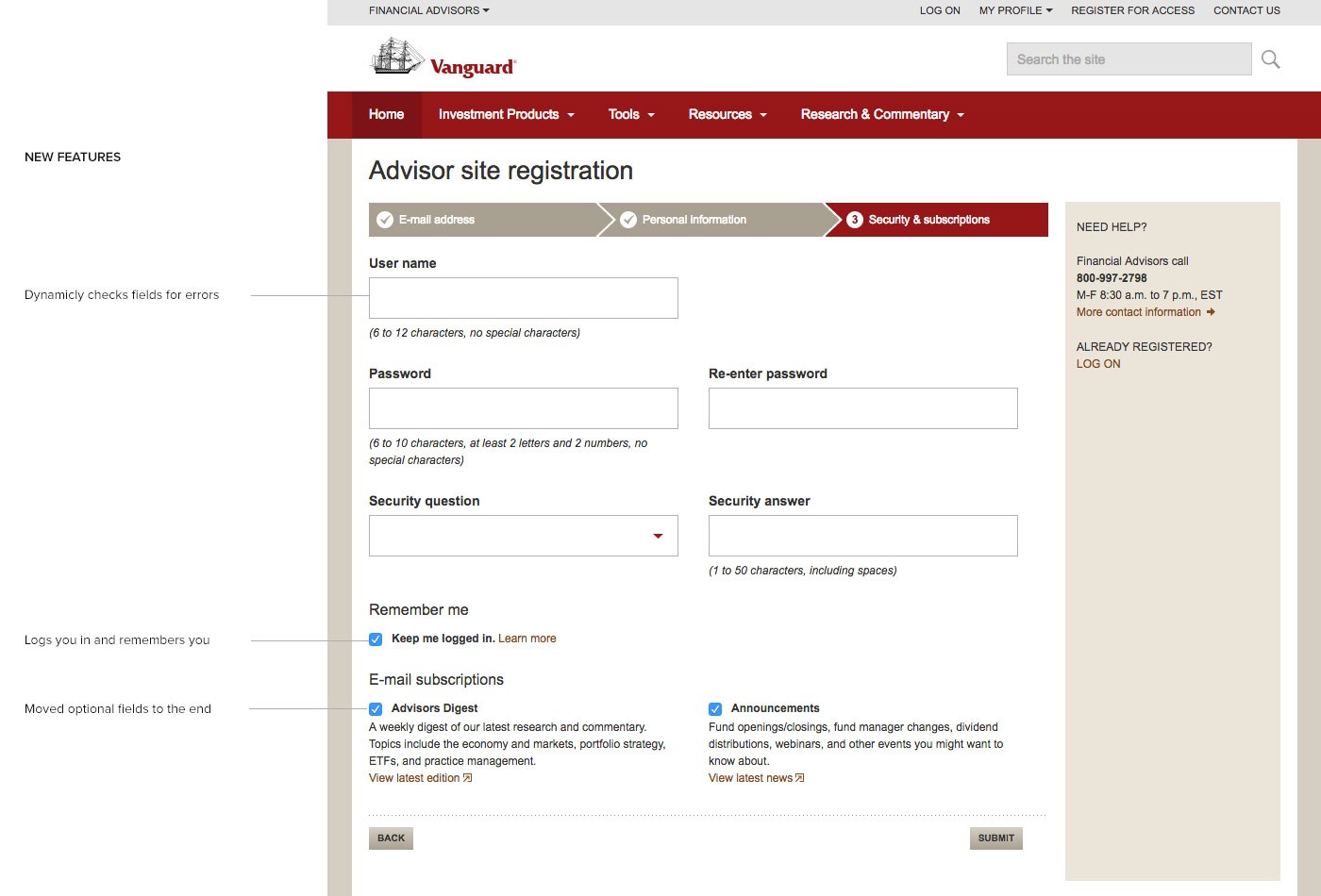
I redesigned the page into a three step registration flow with a progress indicator along the top. Significant effort went toward working with the information security team to loosen the field requirements and reduce friction for the user. Additional steps I took to improve conversion included:
- Employed conditional logic on several field sets
- Live field validation on the page instead of all at the end in a pop-up
- Re-ordered the fields based on hierarchy of importance
- Responsive and touch friendly UI
Results
After being live for 6 weeks the new registration flow resulted in:
PROJECT 3
User Login
Summary
Scope
Redesign the user login experience.
Discovery
The site contained a sidebar on most pages with a login link which ultimately brought the user to a new page to complete the login.
Problems I Identified
- Sidebars were built at different times with different UI standards
- They didn’t all link to the same login page, there were multiple login pages with different designs
- Many login pages had outdated components that were not responsive or touch friendly
- Lost opportunity to tell the user why they would want to register if they hadn’t already
Solutions
- Documented all the various login pages
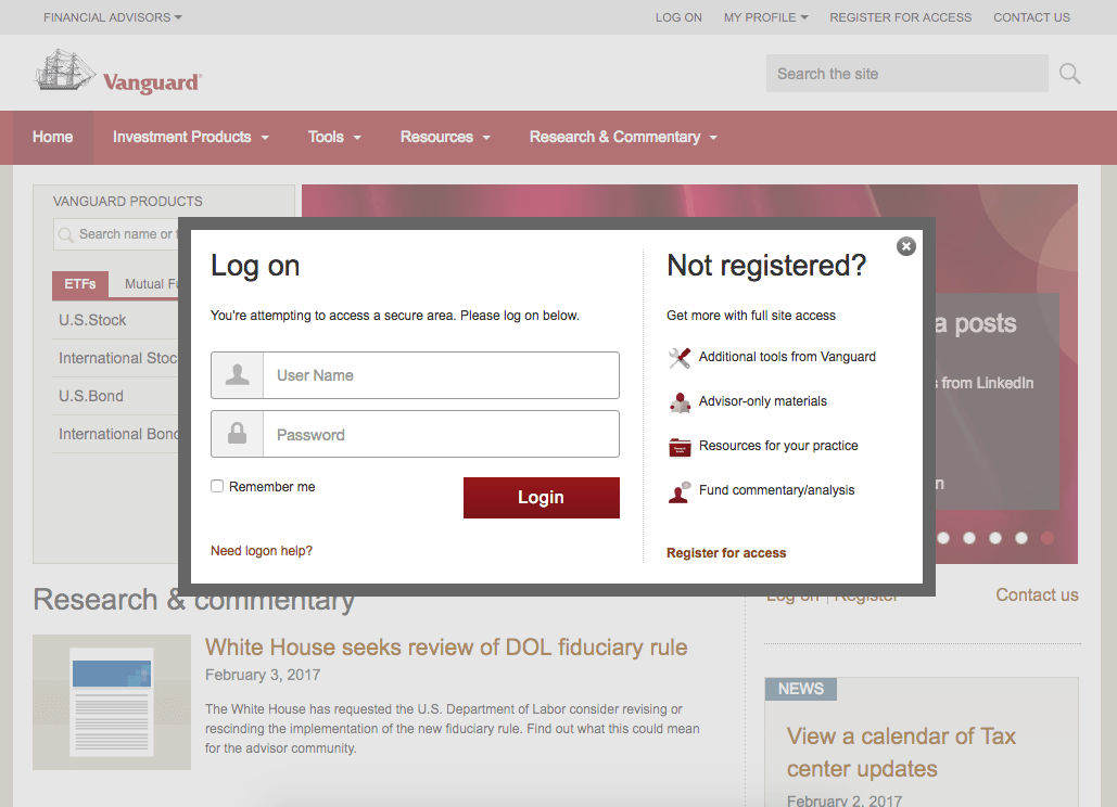
- Designed a single modal window that could be triggered from the login link on every page
- Implemented our new style guide direction – touch friendly, modern and responsive
- Introduced content to tell users why they should register for the site if they hadn’t
Wins
- Solved a logistic and maintenance issue due to many different pages serving the same purpose
- Created a consistent experience regardless of what section users entered from
- Took less time to login by reducing page load
- More delightful UI
- Better error handling
- Responsive design and touch friendly UI
Results
The new login experience was well received. The dev team only had to build and maintain a single modal versus the many pages they had before. The marketing team appreciated the opportunity to promote their apps behind the wall. The design team was happy to introduce newly styled components, and users received a quicker, simpler, and more consistent user experience. This project was done in 2016 and as of 2020 most of the experience is still on the site unchanged.
PROJECT 4
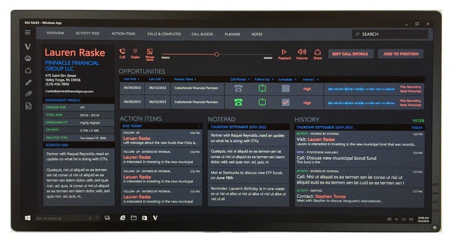
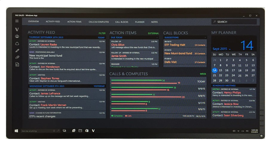
CRM – Conceptual UI Design
